Saturday, April 28, 2012

I read books...NOT


Truth be told, I hate reading. Okay so maybe I don't hate reading...it's more that I don't like to be forced to read. Nor, do I have time to read. I can hardly take five minutes to read the directions for a recipe in a cookbook. I'm not sure if this is just the lazy part of my personality or due the fact that I had to read so many literary journals, white papers, etc. in my previous life.

What I do enjoy are pictures in a magazine, book, on a flyer/poster, etc. What I've come to realize most recently is that I am in love with the integration of text and imagery...especially on books and in magazines. I think it started when I first laid eyes on these books:


The imagery. The details, the designers choice of color and material. It's something about small little details that I enjoy. Something so simple and worldly given new life with fine detail.  Upon further investigation, I found out that Jessica Hische is the amazing person behind this work.


Lettering and illustrative patterns for a gala announcement
to help raise money for the Make-A-Wish Foundation - also by Jessica Hische

To learn more about Jessica Hische check our her website...it's filled with awesomeness. 

Friday, April 13, 2012

Moomah.


Product/Item: Business Collateral for Moomah, a creative arts café for parents, children and friends in TriBeCa, New York – founded by Tracye Stewart

Design Firm: Apartment One, Brooklyn, NY

So what is Moomah anyway? It's a place that encourages creativity and connection, where imagination is king, where we are inspired by our children and hope to inspire them and teach them that anything is possible.
Moomah's four core brand values are: connect, create, discover and nourish - Moomah being a space to encourage parents, children and friends to connect, create, discover and nourish their relationships to one another, themselves and the world around them. Those values also speak to some of the many activities one can participate in when visiting Moomah.

Wow factor (for me): Simple, Organic, mystical/magic graphics, thought provoking, packaging and products show that the designers were “aware of clientele”

What they (Apartment One) said about the design: “We wanted to create a memorable and recognizable brand language without having to put a logo on all applications. We created custom application-specific illustrations filled with the wonder, magic and heart of Moomah and placed them above a dotted line and type to set the foundation. These illustrations and corresponding tag lines were conceptually developed for their specific applications (business cards, stationery, café menu, hot and cold cups, shopping bags, stickers, brochures, website, etc.).”


Source: 


Friday, April 6, 2012

SA+P: The School of Architecture & Planning at Morgan State

The Center for the Built Environment & Infrastructure Studies (CBEIS): 
The New School of Architecture & Planning Building, Opening August 2012

Located in Baltimore, MD the School of Architecture and Planning at Morgan State University is one of two Schools of Architecture & Planning located in the State of Maryland. The University of Maryland College Park is the second school with a school of Architecture & Planning*. Frostburg State is said to have an architecture program but I couldn’t find any information on it. However, Frostburg State does have an Urban and Regional Planning which is house in its’ Geography Department.

The School of Architecture & Planning at Morgan (SA+P) is 25 years old and its focus is on its urban environment (natural and built). The school addresses, from an interdisciplinary perspective, the social, environmental, physical, economic, and political issues that shape urban communities and form.

The school has a diverse student community and its location in Baltimore lends itself to significant ties with community groups, local design and planning professions, city government and non-profits. The schools focus on service and outreach also brings students into direct contact with diverse groups of people, culture/ lifestyles, socio-economic issues, and opinions of those who live or work in urban areas.

Disciplines include in the school include: Architecture (undergraduate and graduate), Landscape Architecture, City & Regional Planning, Architecture & Environmental Design, and Construction Management (undergraduate).


Studio Space at the SA+P, Montebello Building

I thought the SA+P was atypical for a few reasons: it’s location in an urban environment, it’s focus on the natural and built environment as it relates to its setting, it’s diverse nature (which lends to the Mission of MSU). Most of the students that are enrolled in the graduate programs in this department are students who have fulfilled their baccalaureate degrees and want to pursue a master’s – they want to stay at Morgan.  Others are adults who have a degree and are advancing or changing their careers, those interested in the built environment, and socio-economic issues/trends within cities and towns, community development and even politics.

The SA+P website does not do the school much justice and its design makes it very evident. The school also markets their undergraduate architecture program more than their graduate programs via print – partially because the undergraduate program is newer and the school started out as a graduate school. The school does send out a monthly newsletter which is sent out to students, outside vendors and professionals. Otherwise the school is marketed through college fairs, word of mouth via staff and alumni, the local Baltimore AIA, ASLA, and ACIP chapters, and through mentorship programs with local design firms.

SA+ P Publications
Undergraduate Mailer (PDF)
Annual Report: SA+P Year In Review

*Programs at UMCP include architecture, Landscape Architecture, Urban Studies & Planning, Historic Preservation, and Real Estate Development

---
Source: MSU. SA+P


Friday, March 30, 2012

On Unity...and a few bits and pieces.

On Unity 
"All writing is ultimately a question of solving a problem. It may be a problem of where to obtain the facts or how to organize the material. It may be a problem of approach or attitude, tone or style.  Whatever it is, it has to be confronted and solved."
-William Zinsser
I found this statement in Chapter 8 of William Zinsser's book to be very true. One current event where this question, approach, attitude can be viewed is with the recent Trayvon Martin tragedy. I've read many articles and have listened and watched numerous videos online and television where I am still trying to understand how the stories told and written are being organized - are they organized? There are facts here and facts there - sometimes there is no unity within the articles read. The story has been approached differently by the media, persons interested in the case, the families, etc which in-turn have lead to different tones and attitudes being expressed. One could also wonder if the material is sometimes controlling the writer (in these types of situations).

----
Finds on "Bits and Pieces" - Article on the Trayvon Martin tragedy.
Source: Joe Scarborough On Trayvon Martin: Conservatives Are 'Fools' For Taking Political Stance
The Huffington Post/ March 30, 2012

The period.
"Why is it that some on the right are actually taking this up as a cause?" Scarborough asked. "As National Review said almost immediately after it happened, this has nothing to do with gun rights, this has nothing to do with the Second Amendment, this has nothing to do with stand your ground laws, this has nothing to do with the NRA. This has everything to do with a guy that's trying to play security cop, who is unhinged, who chased down and shot a 17-year-old kid armed with Skittles and iced tea."

The dash.
"I guess in their warped, twisted, distorted, political worldview, that makes this dead 17-year-old boy — who was kept in the morgue for three days before they even notified his parents of his whereabouts — I guess that makes it okay?" he said.

Verbs.
"This is beneath contempt," Scarborough railed. "These people on the far right are being fools to try to make this a political issue.”

Thursday, March 15, 2012

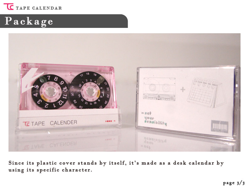
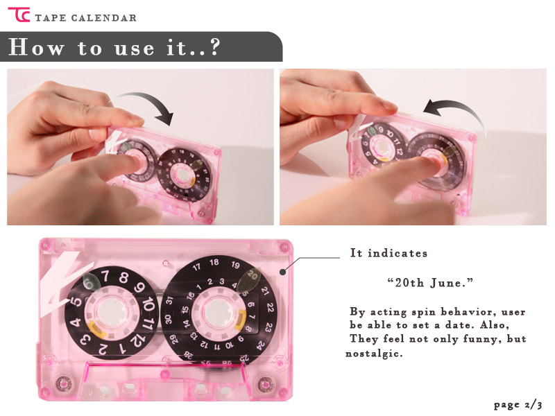
Day, Month, and Year Keepers: Calendars


How Do you keep track of life? I never really thought about it. To me it seemed having a calendar of some sort was just a normal thing to do. One can't possibly remember every event on his/her own could they? Searching for calendars for this weeks blog entry was a bit interesting. I'd say that my little campus calendar and the free calendar that I receive yearly from the automotive store are flimsy. Okay, maybe that was a bit harsh...they do serve their purpose..and well. Below are some calendars that I found online that I found a bit interesting in respect to their concept, simplicity or use of detail.

 
Source: Designboom

copy_16_image2.jpg 
Source: Designboom 

tapecalendar3.jpg 
tapecalendar2.jpg 
Source: Designboom


Source: Fornasetti.com

Friday, March 9, 2012

Identity: Bear Facts 2012

Just in...Morgan State University's Bear Facts 2012!
Bear Facts is a 29 page booklet which provides the unknown and known a bit (or three) of information on the University. Bear Facts is used as a marketing and promotional piece for Morgan. It's given out to prospective students, the community, Legislators, existing students and staff, etc.  Here's a quick look:

[Bear Facts: Back Cover & Front Cover]

[Bear Facts: Pages 14 & 15, National and State Rankings]

[Bear Facts: Pages 20 & 21, Capital & Operating Info]

[Bear Facts: Pages 28 & 29, MSU's Motto and Facilities Info]

Also found inside are:
Greetings from the University President
A brief history of MSU
An overview of MSU's Strategic Plan
Colleges, Schools & Institutes within the University
Degree Programs offered
Key Administrators, University Council, & Regent Members


Saturday, March 3, 2012

Packaging: Hair Care/Accesories

PRODUCT: Pantene Hair Care

[Target display of hair accessories]


Pantene uses Warm and relaxining colors as a part of their packaging. When I walked through this aisle of the store I thought, "Hey that feels good". Seeing this display made me anticipate warm weather and going to the beach. Unfortunately, when I looked for the same product online, I didn't feel the same. I was more overwhelmed by the listing of products for Pantene and there was nothing that grabbed me and pulled me in to look further. However, I do appreciate the fact that I was provided the opportunity to see what other guests who viewed the same product also viewed elsewhere related to hair care.

Image source: Target.com


PRODUCT: Goody Hair Accessories


[Target display of Hair Accessories]

Can you say wow!?! Goody uses bright colors as a part of their hair accessory packaging. They also uses kids on their product display board. It's very clear that this product is geared towards tweens, teens, and in betweens. Although effective, I personally would by-pass this section of the hair accessories as it's to bright and tells me to move on..It also says, to me, thank God I don't have a little girl!

The online version of this product as seen in the picture below, is similar to the Pantene product. An image of the product is displayed and product details are provided. Target again allows the viewer to view other products of guests who viewed the same product.

[Image Source: Target.Com]